The post 4 Reasons Why You Should Consider a Responsive Website appeared first on Linda Curty Web Design.
]]>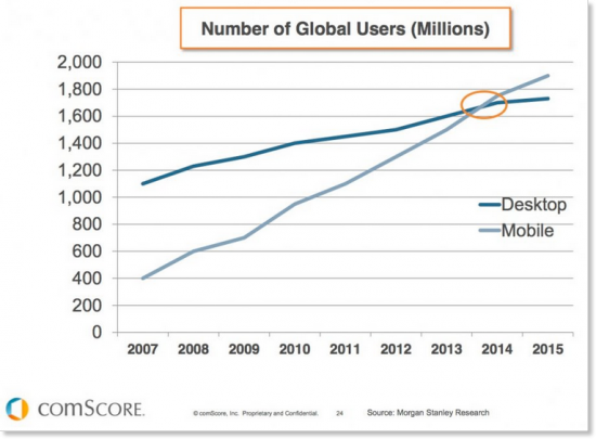 In fact, comScore states that Internet access via mobile device is now greater than access by desktop computers.
As an increasing number of people use their tablets and smartphones to surf the Web, it has become more and more important to develop websites that work seamlessly across these platforms. The way users interact with sites on these mobile devices varies significantly from how they access them from a computer. Users are now touching rather than clicking, and screen-size and pixel-resolution have become important factors. Because of these reasons and others, it has become necessary for designers to create sites that keep the look and feel of a brand’s website while simultaneously optimizing it for use across a variety of platforms.
Enter Responsive Website Design (RWD). This capability is critical websites in today’s Internet usage environment, allowing sites to be easily accessed and viewed on all of these devices. So just what is responsive design, and why do we need it?
Responsive Website Design Explained
RWD is a web design and development approach that creates a site that responds to the size of the user’s device or screen (from smartphone to tablet to laptop to large, widescreen monitor).
On responsive websites, text, images and video, layouts, and other elements, re-size themselves depending on the screen size of the device the site is being viewed on. This means brands do not need to create secondary mobile site, nor do users have to click to transition between mobile and desktop versions.
RWD has become the simplest option to connect with users across a range of mobile devices while ensuring a seamless user experience, improving Search Engine Optimization (SEO), and keeping Google happy.
One is Better than Two (or Three)
In the past, developers would create two separate versions of a site one for desktop users and one for mobile users. There are 3 main advantages to using a single responsive site versus a separate mobile site:
Cost Advantages
It costs companies more (sometimes significantly more) to build two websites than one. Additionally, the lack of navigation and content that comes with traditional mobile sites can drive frustrated customers to competitors – resulting in lost revenue for the company.
Consolidated Analytics/Reporting
Responsive website design means one consolidated analytics report. This means a broader picture of how users are accessing and using your site and easier analysis and monitoring. Furthermore, most analytics tools, such as Google Analytics, offer filtering options so that users can compare mobile access to desktop access.
Content Maintenance and Accuracy
When you are maintaining two separate sites, you often have the same content in both locations – this means making sure the content is updated correctly on both sites. A single, responsive site means less time to update and less chance of having the wrong version or different/outdated content.
User Experience
Another advantage of responsive website design is improved user experience. Regardless of what device a user is accessing the site from (be it smartphone, tablet, or desktop computer), the functionality, as well as the look and feel, is consistent. This makes it easier for users to find, read, and share content. Furthermore users aren’t redirected between mobile and desktop versions. A positive user experience leads to higher conversion rates.
Search Engine Optimization
Quite simply, Google recommends responsive website design – and with 67% of the search traffic market share, that alone is a good reason to listen.
- Having a single URL with the same code makes it easier and quicker for Google to index the site, thus reducing needed resources. Managing a single Search Engine Optimization (SEO) campaign is also easier and less expensive than managing two.
- Unique content is vital for SEO, the duplicate content that comes from placing it on separate mobile and desktop sites may have the effect of lowering your site in search engine rankings.
- The redirect to a mobile URL typically increases the amount of time it takes to load a mobile site to about 7 seconds, whereas Google looks for sites to have faster load times (ideally about 1 second). Because responsive website design eliminates the redirect to a mobile URL, your site will load more quickly on mobile devices.
The post 4 Reasons Why You Should Consider a Responsive Website appeared first on Linda Curty Web Design.
]]>